Upcycle Thrift Store Art
As an Amazon Associate and member of other affiliate programs, I earn from qualifying purchases.
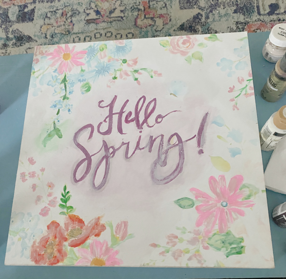
Have you ever browsed the Thrift Store and discovered a piece of art or decor that has seen better days? You know the kind, where the bones are good but the presentation is old, faded, worn? Why not refresh those faded objects with a little paint? With some swoops and swirls and a touch of paint here and there, that art can easily be revived and refreshed. This spring canvas artwork has always sported muted colors on a white background. But the pastels have faded and you can hardly even read the letters. With some simple highlights with vibrant paint colors, we can refresh this art in time for spring!

As always, if we are renewing, repurposing, reusing, or upcycling you know it is time for the Thrift Store Decor Team monthly projects. I am excited to see some spring projects this month. Be sure to check out the team projects that are each linked at the end of this post.
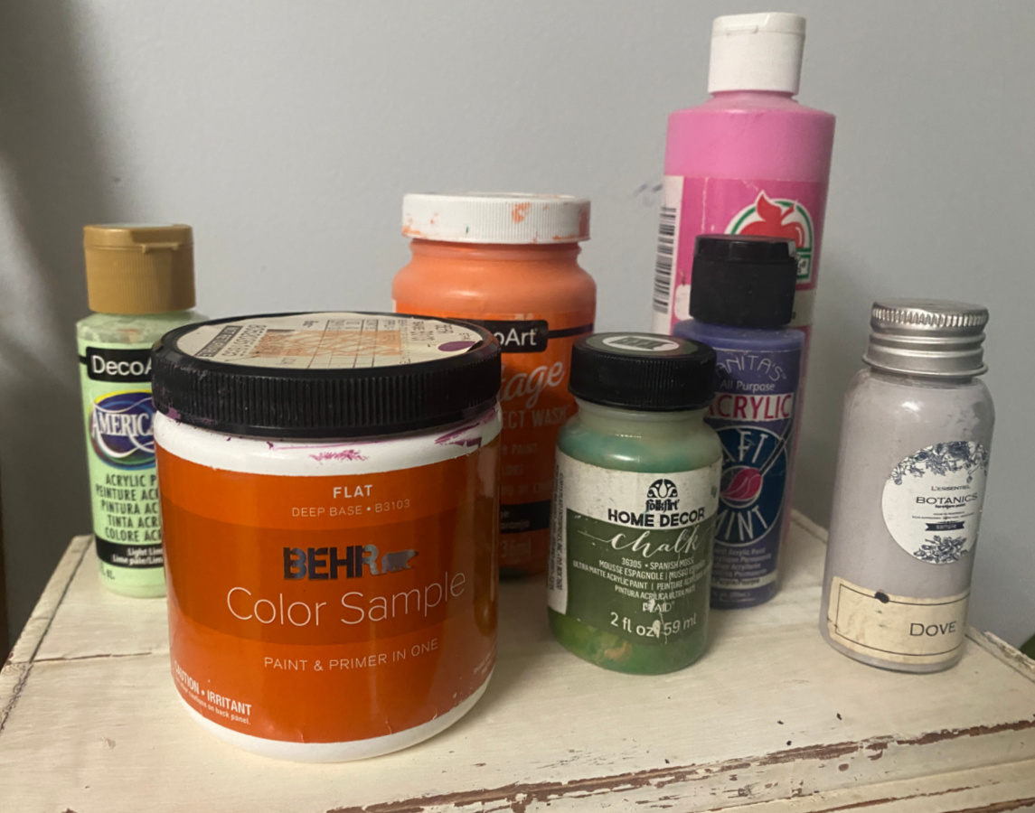
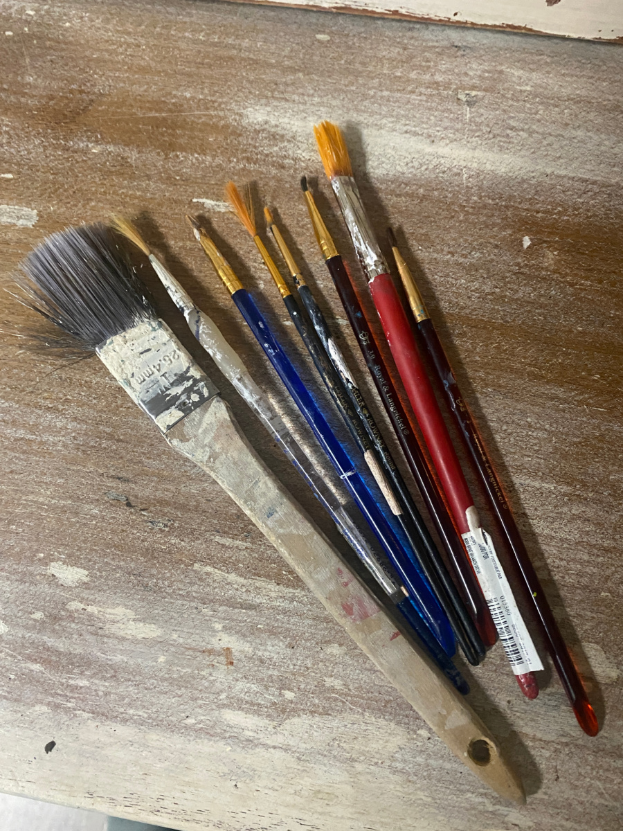
Step one, I gathered my supplies:
- Craft paint in vibrant colors
- White paint for base coat
- Various paint brushes
- cup of water (to rinse brushes0
- paper towels (for drying brushes and blotting paint when I make mistakes ’cause there will be mistakes)
PAINT!
I started with the easiest flower to refresh…the daisy. I traced the edges of the petals with some bright pink. I just continued around the flower until I had highlighted every petal.
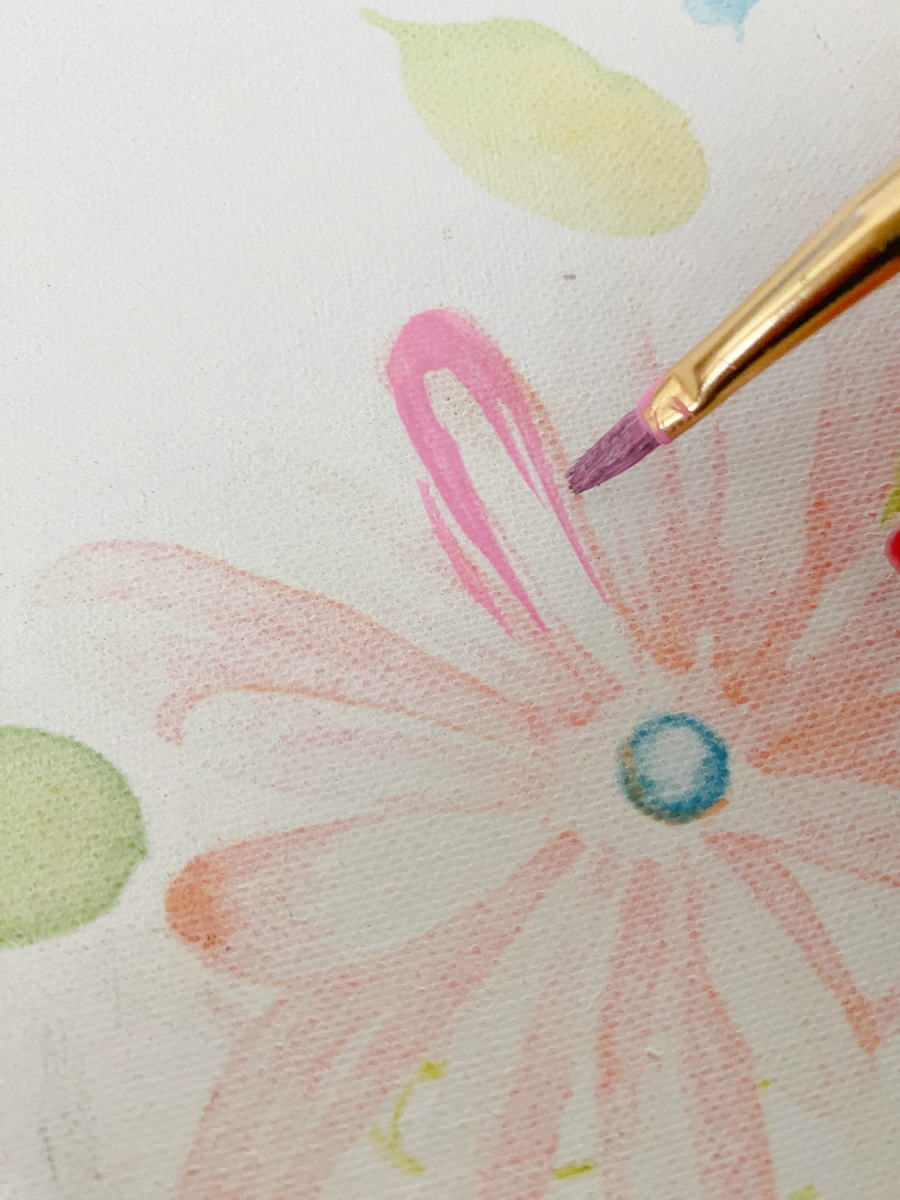
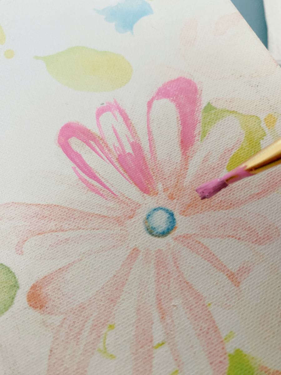
Then, I filled in the lighter areas with a paler color to add freshen those areas. I went back with a few darker swipes of paint to mimic shading.
Next up was the roses. Same process…add color on the edges, refresh the centers, add shading.
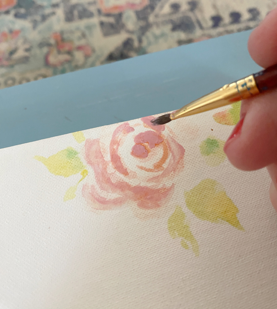
I worked my way through the types of flowers and moved onto the leaves and stems, highlighting and adding dabs of vibrant colors.
LETTERING
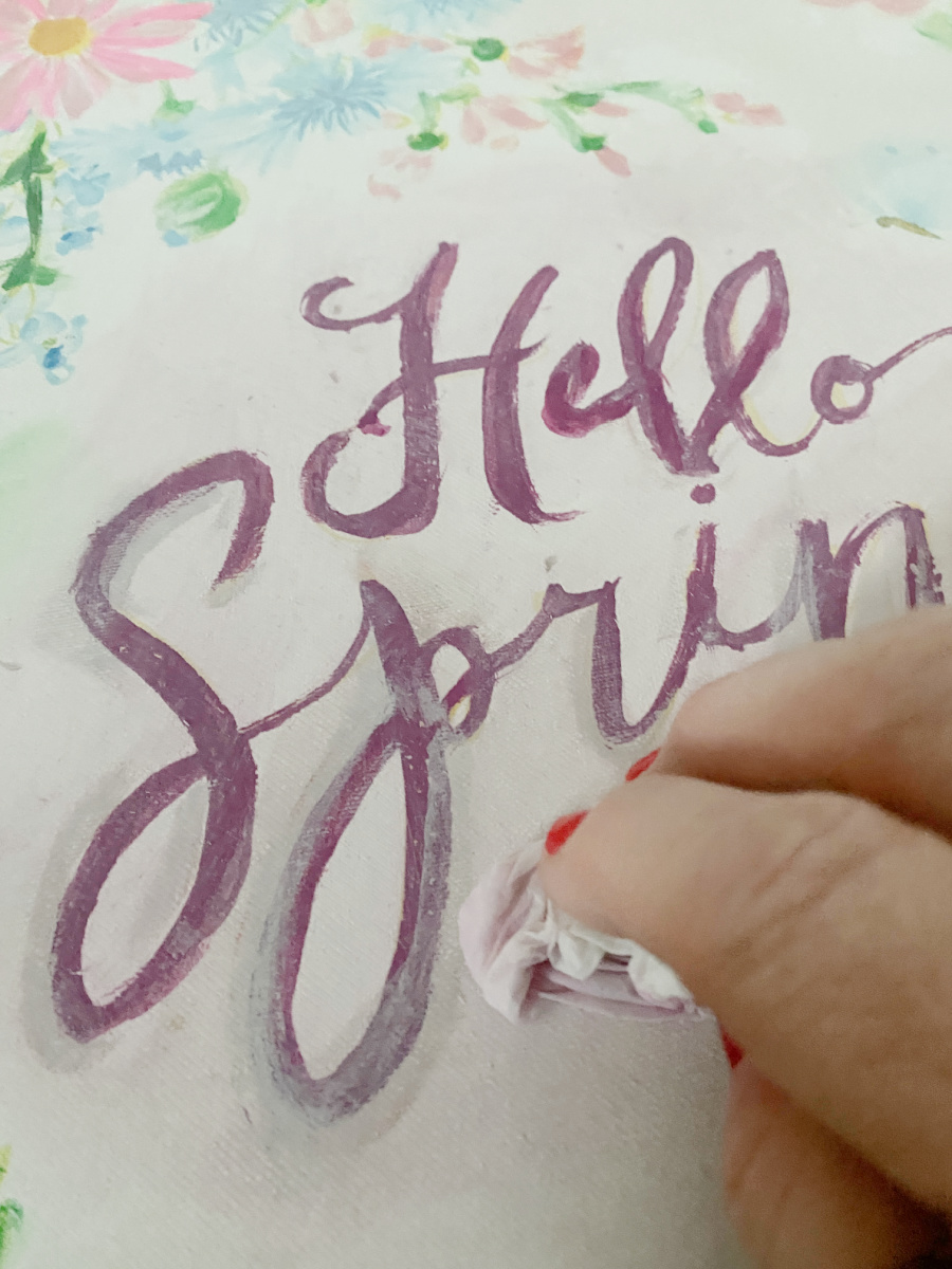
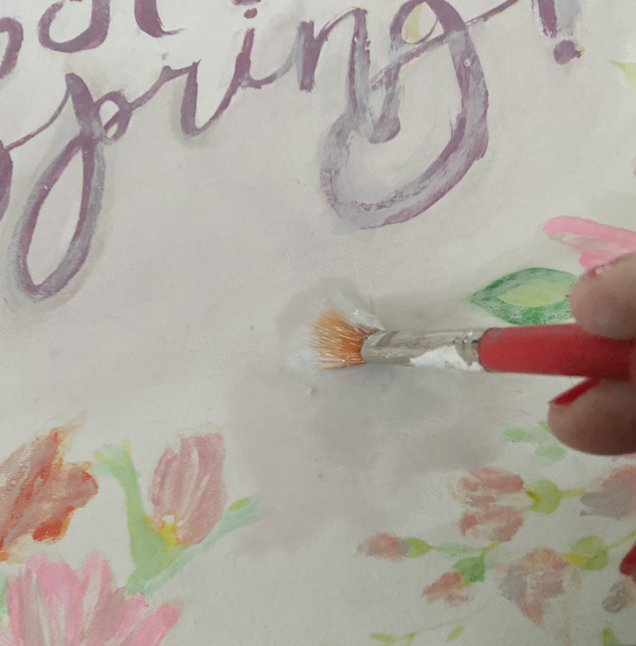
The last part was the lettering. I selected a bright violet red, a bright purple color.
***And here is where I will pause and say…USE THE RIGHT TOOLS! I was rushing so I grabbed a few paintbrushes that were handy.
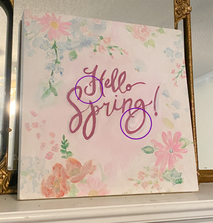
Midway through the lettering touch up process, I realized that better brushes suited for lettering were needed. Did I stop and rummage through the supply closet to find them? NO! Consequently, the lettering was a mess. The lines were too thick. They were not crisp and sharp. So I had to wait for the paint to dry to fix the mess.
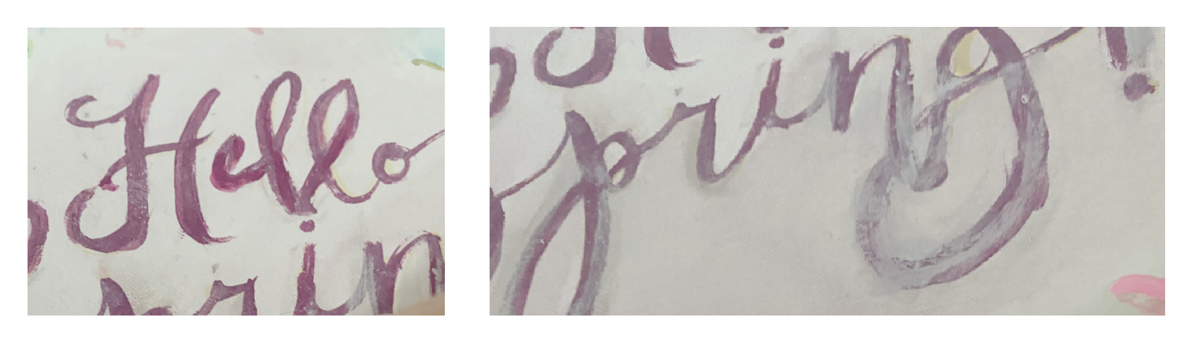
The good thing about paint is that it is always easy to fix. My patience, or should I say my impatience…not so much. Take your time! Use the right tools! Reduce your frustration level! Do it right the first time. (The project is finished, sort of, but I will still need to touch up the lettering a bit when my temperament is better). LOL.
Slow and steady wins the race! Even veteran creators make mistakes and have to pay the consequences of rushing a project! So give me a few days…and check back for the “really finished” lettering.
Ok, enough side notes…back to the project.
Load your brush and simply follow the lines. There are brushes for lettering and I would highly suggest investing in a few. Some have very flat bristles that will ensure crisp straight edges on your letters. Some are skinny long that allow you to follow the curves of a letter. PRACTICE! The more comfortable you are with the process, the easier it will be. PRACTICE!
Another reason to practice? Dark purples and red paints tend to stain a white canvas. Such is difficult to wipe away and just as difficult to cover. So, if you make a mistake, allow the paint to dry completely and cover the mistake several times. Several times means apply the white over the purple mistake and allow the paint to dry. Only when the paint is completely dry should you repeat this process as many times as needed.
When the paint has dried, use a smaller brush to fill in the letters. I would also suggest tracing out the lines where you want them and slowly fill them in with small strokes to avoid more mistakes.
Good lettering takes lots of practice. So, don’t get discouraged. The answer is PRACTICE.
FILLING IN SPACE
When you are touching up an existing piece of art, it’s really a game of color matching. If I can’t match a color, I get as close as I can and I try to blend. In the photo above, I used a light grey wash and covered the entire canvas OVER the design. This brought coherency to the project. And a little white wash freshens everything.
FINALLY
So here is the final project with the disclaimer that I will go back and touch up those letters a little bit more. Sometimes you just have to walk away for a minute and then resume.
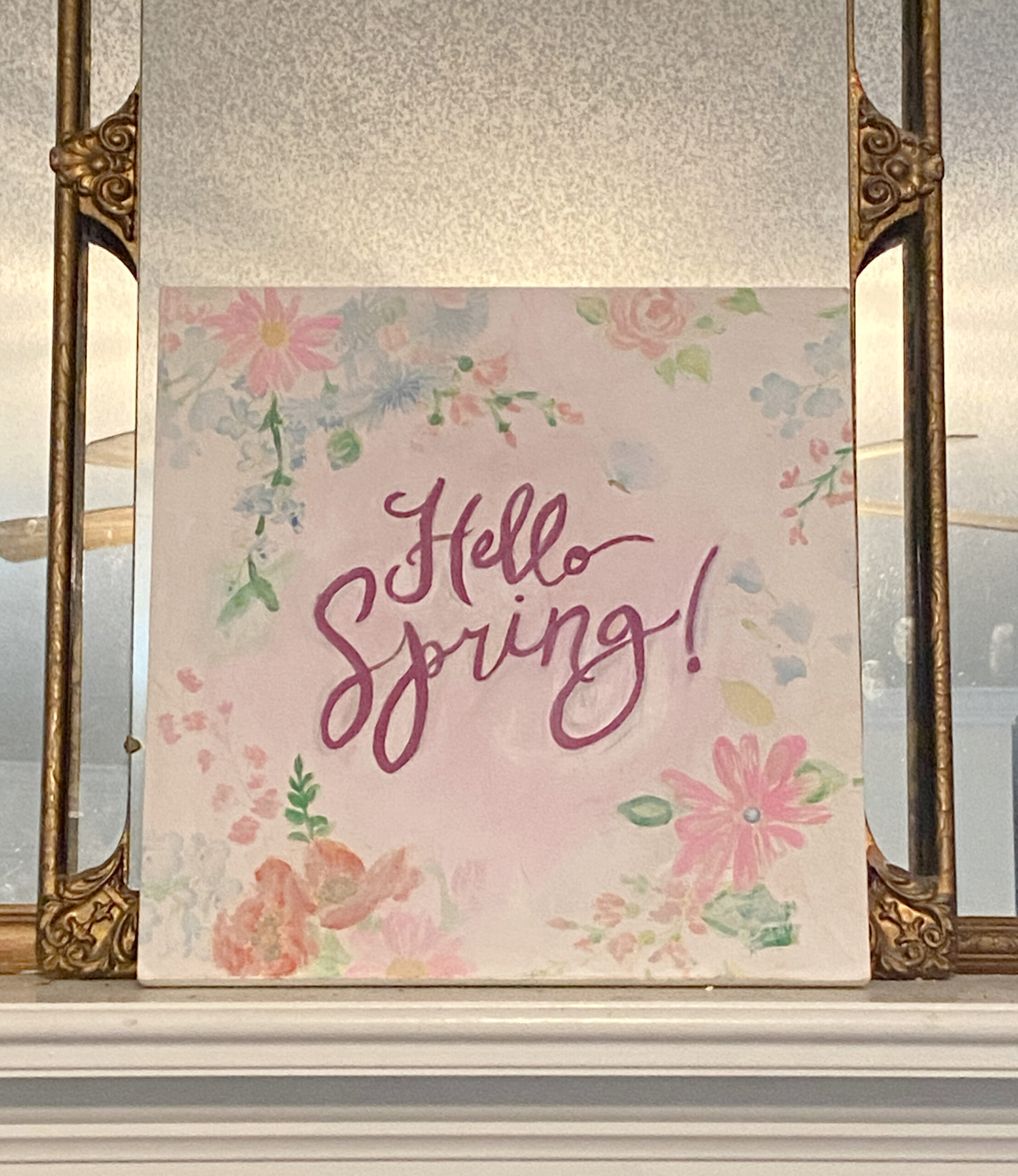
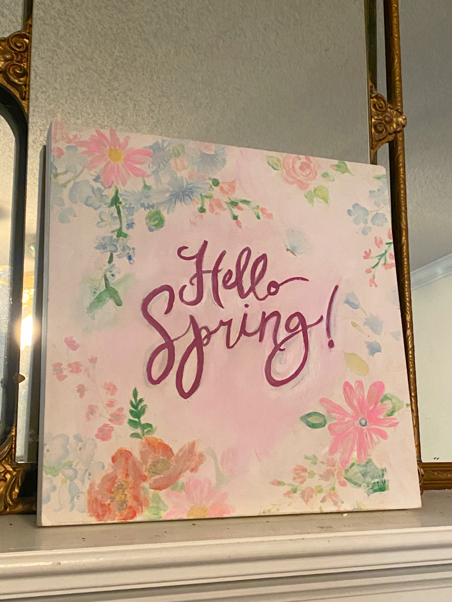
I hope you enjoyed my not so perfect project! Every now and then, the project doesn’t go as planned and you have to pause and regroup and sometimes step away. And that’s okay!

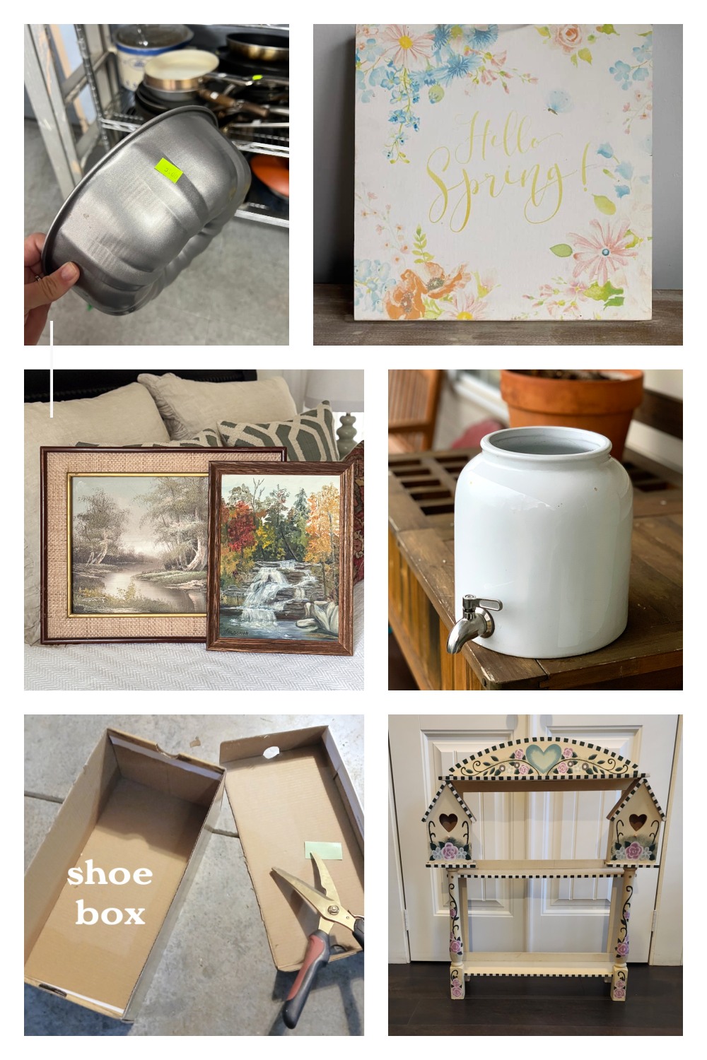
Bundt Pan Bird Feeder My Uncommon Slice of Suburbia
Upcycle Thrift Store Art Shop At Blu –YOU ARE HERE!
Two Ways to Update Thrift Store Art Our Southern Home
Repurposing A Damaged Stoneware Crock House Of Hawthornes
Small Country Shelf Makeover My Repurposed Life
Diy Easter Display Petticoat Junktion

Love this idea! So clever to freshen up the look and still get some life out of it. I think you did a great job…no touch up required!
Thanks, Christy. It’s not as bad as I thought. A little smudge gives it some character!
I love how this turned out Sue! Love the more vibrant colors, so pretty and perfect for spring.
Thanks, Kristin! I’m not sure how I missed your comment.
Suzanne,
I never would have thought about upcycling art this way. Give yourself grace, you did a lovely job! I too, am an impatient crafter ,so I know where you’re coming from.
Pinned!
gail
You are so kind. I’m to particular but it’s over the mantle and looks very springy…from afar. LOL.